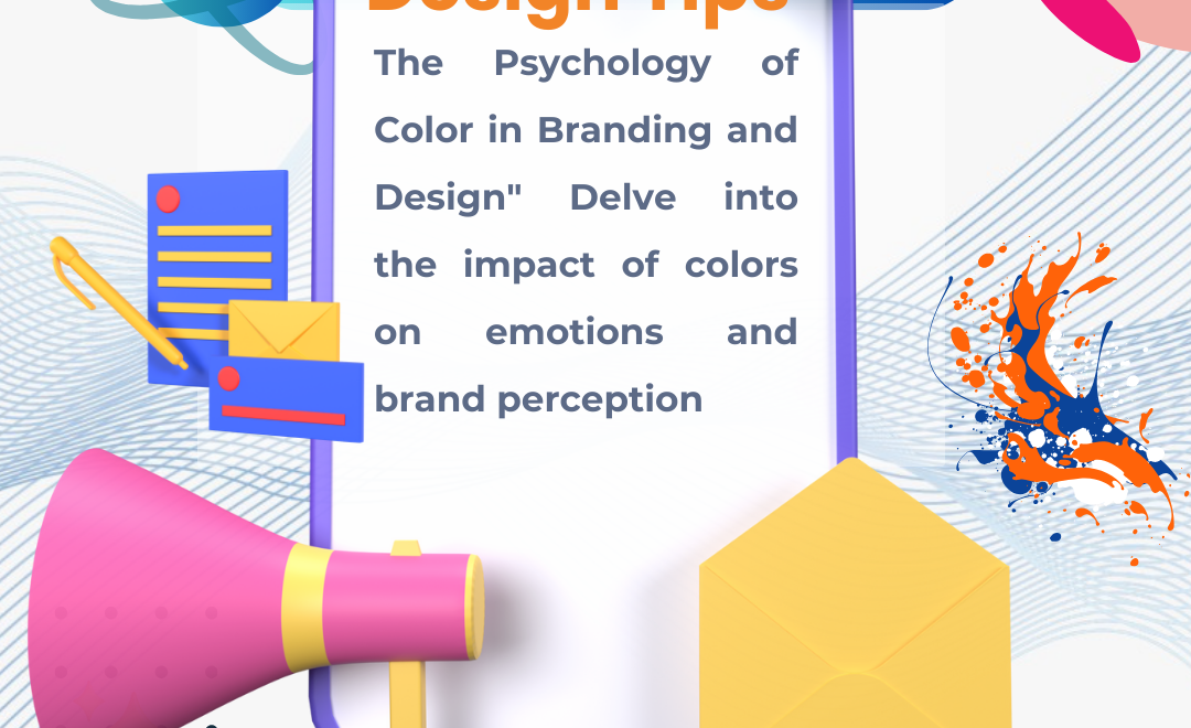
In the dynamic realm of branding and design, the significance of color, driven by the psychology of color, cannot be overstated. The colors meticulously chosen for a brand or design go beyond aesthetics; they possess the remarkable ability to elicit powerful emotional responses and mold perceptions. Delving into the psychology behind color is paramount for businesses with a strategic vision, aiming to not only establish a strong brand identity but also to forge enduring connections with their audience.
The Impact of Colors on Emotions
Warm Colors: Creating a Sense of Energy and Passion
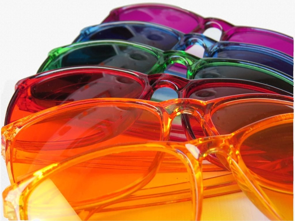
Warm colors, comprising red, orange, and yellow, wield a profound influence on emotions, igniting feelings of energy, passion, and warmth. This psychological phenomenon is a powerful tool for brands aiming to convey dynamism and enthusiasm.
Consider the color psychology as seen in the iconic red of Coca-Cola. This vibrant hue is more than just a shade; it’s synonymous with excitement and vigor. The psychology of color at play here is evident in how this red is instantly recognizable, creating an emotionally charged connection with consumers. Coca-Cola strategically taps into the color psychology, using red to evoke not just a visual impression but a visceral response, making its brand memorable and compelling.
Cool Colors: Instilling Calmness and Trust
On the flip side of the color spectrum, cool colors like serene blue and tranquil green have the remarkable ability to evoke a sense of calmness and trust. This is not a mere coincidence but a result of the psychology of color. Brands strategically utilizing cool hues aim to establish a perception of reliability and serenity. Take the calming blue employed by the tech giant IBM, for instance.
The psychology of color here is fascinating; it suggests dependability and stability in the fast-paced tech industry. IBM leverages the psychological impact of color, using blue not just as a visual choice but as a strategic tool to convey trustworthiness. Color psychology in this context goes beyond aesthetics; it becomes a language through which a brand communicates its values and reliability to its audience.
Neutral Colors: Timeless Elegance and Versatility
Neutral shades, such as the traditional trio of black, white, and gray, offer a flexible canvas for brand expression. This isn’t always merely aesthetics; it’s approximately the psychology of coloration and its effect on belief. These hues exude elegance and timelessness, providing a timeless backdrop for brand applications.
The psychology of color in neutral tones allows for easy adaptation across diverse contexts. Luxury brands, in particular, leverage neutral palettes to convey sophistication and exclusivity. This isn’t just a design choice; it’s a strategic implementation of the psychology of color. The neutrality becomes a stage on which the brand’s identity unfolds, making it accessible and adaptable without compromising on the aura of exclusivity. Understanding the psychology of color in neutrality is key for brands aiming for a timeless and sophisticated image.
In essence, the psychology of color is a potent force shaping the emotional landscape of brand perception. Whether it’s the vibrant reds invoking excitement, the cool blues instilling trust, or the neutral tones conveying timeless elegance, each color choice is a deliberate and strategic move. Brands that grasp the psychology of color transcend the realm of aesthetics; they enter the domain of emotional connection, creating a visual language that resonates with their audience.
Brand Perception Through Color
The psychology of color is a potent force in shaping brand perception, transcending linguistic barriers, and resonating on a profound cultural level. Consider the color red, often associated with passion and energy. In Western cultures, it signifies excitement and love, evident in the iconic red hue of the Coca-Cola logo. However, in some Eastern cultures, red is synonymous with luck and prosperity, a subtle but crucial nuance in the psychology of color.
This exemplifies the impact of cultural influences on color perception. White, another color laden with symbolism, starkly illustrates this point. In Western cultures, white typically symbolizes purity and cleanliness, making it a popular choice for weddings and healthcare institutions. Contrastingly, in Eastern cultures, white is the color of mourning, emphasizing the importance of recognizing these cultural nuances in the psychology of color.
Understanding these subtleties is not merely an intellectual exercise but a practical necessity in building a universally resonant brand identity. The psychology of color is a universal language, and crafting a brand image that transcends cultural boundaries requires a meticulous understanding of how colors are interpreted across the globe.

Cultural Influences on Color Perception
The psychology of color is deeply entwined with cultural influences, creating a tapestry of meanings that can either enhance or hinder brand communication. Take the color blue, often associated with trust and calmness. In many Western societies, blue is a go-to choice for brands aiming to convey reliability and professionalism. However, in some Eastern cultures, blue can symbolize immortality and is often used in religious contexts.
This cultural diversity in color perception poses both a challenge and an opportunity for brands. The key lies in navigating these nuances to create a brand image that resonates universally. For instance, tech giant IBM strategically utilizes the calming properties of blue, fostering a sense of trust and dependability in a fast-paced industry. This conscious alignment of color with cultural expectations exemplifies the intricate dance between cultural influences and color psychology in brand perception.
Color Consistency across Touchpoints
The journey of brand perception is not a linear path but a multi-faceted experience across various touchpoints. The color psychology must seamlessly weave through each interaction, creating a cohesive and memorable narrative. Color consistency across touchpoints is the linchpin in this narrative, ensuring that every encounter reinforces brand recognition.
From the logo to marketing materials, maintaining a cohesive color palette is not a superficial exercise but a strategic imperative. Imagine encountering the golden arches of McDonald’s without their iconic red and yellow hues. The immediate recognition and emotional resonance tied to those colors are quintessential in the psychology of color.
Consistency fosters a continuing connection between the brand and its audience. It’s not merely approximately choosing a color; it’s approximately curating and enjoying. When a consumer sees a consistent color scheme across advertisements, packaging, and digital platforms, it solidifies the brand in their mind. This consistency, rooted in the psychology of color, contributes to a brand presence that is not just recognizable but deeply impactful.
In easy terms, it’s like a familiar face in a crowded room – easy to spot and instantly memorable. This is the power of color consistency, a concept deeply entrenched in the psychology of color and brand perception.
Practical Applications in Design: Harnessing the Psychology of Color
Call-to-Action Buttons: Prompting Action with Red
In the fast-paced digital landscape, the color of call-to-action (CTA) buttons holds a profound influence over user behavior. Color psychology reveals that red, synonymous with urgency and action, becomes a compelling choice for buttons demanding immediate attention.
Consider the “Sign up Now” button on a website. By strategically using the color red, the button taps into the color psychology to evoke a sense of urgency and prompt users to take immediate action. Studies indicate that websites featuring red CTAs experience higher click-through rates, showcasing the real-world impact of understanding color psychology in design.
Packaging Design: Crafting an Emotional Connection
In the realm of product packaging, color serves as a silent yet powerful communicator of product attributes. Color psychology manifests in the way consumers perceive and connect with products based on packaging hues.
Imagine the packaging of a premium chocolate brand. The use of rich, deep browns communicates a sense of decadence and indulgence, aligning with the product’s message of luxury. This application of the psychology of color creates an emotional connection with the consumer, influencing their perception of the chocolate’s quality even before tasting it. This demonstrates how color when strategically employed, becomes a key player in conveying brand values and eliciting desired emotional responses.
Practical Insights for Everyone
Understanding the psychology of color doesn’t require a degree in design or marketing. It’s a practical tool accessible to everyone, from entrepreneurs to content creators. By grasping the basics, individuals can make informed decisions that resonate with their audience and goals.
Quick Tips for Using Color Psychology:
Know Your Audience:
Before selecting colors, understand your target audience. Different demographics may respond differently to colors based on cultural or personal associations.
Consistency is Key:
Whether it’s your website, product, or marketing materials, maintaining a consistent color palette reinforces brand identity. Consistency builds trust and recognition.
Test and Adapt:
Don’t be afraid to experiment. A/B testing different color variations allows you to assess their impact on user engagement and adjust accordingly.
Consider Context:
The context in which your brand or design is experienced matters. Color psychology can be nuanced, and what works in one context may not have the same effect in another.
The practical applications of the psychology of color extend beyond the realms of design and marketing agencies. By understanding how color influences emotions and perceptions, individuals and businesses alike can make informed decisions that resonate with their audience. From the urgency of red CTAs to the emotional connection forged through packaging, color is a silent yet influential partner in conveying messages and shaping experiences. Embrace the psychology of color, and unlock the potential to make your brand or design stand out in a crowded digital landscape.
The Role of Color in Marketing
Creating Brand Differentiation
In a market flooded with options, the art of standing out is more critical than ever. Enter the psychology of color – a powerful tool that allows brands not just to be seen but to be remembered.
Imagine a supermarket aisle filled with various detergent brands, all vying for your attention. Amidst this sea of choices, a brand strategically utilizing the psychology of color can carve out a unique identity.
The Laundry Revolution: Consider a detergent brand, let’s call it “Eco Clean.” In a market dominated by blues and whites, Eco Clean decided to embrace a vibrant green as its primary color. This departure from the conventional communicates a message of eco-friendliness and freshness.
As consumers stroll down the aisle, the distinct green packaging of Eco Clean catches their eye, creating an association between the color and the brand. Over time, this color-driven brand differentiation fosters loyalty and recall – when they think green, they think Eco Clean.
Evoking Emotional Responses in Marketing Campaigns
Marketers are the architects of emotions, and color psychology is a cornerstone in their toolkit. Colors have the remarkable ability to tap into our emotions and influence our perceptions. Let’s delve into a couple of real-world examples where the psychology of color takes center stage in shaping emotional responses.
Healthcare Campaign – The Tranquil Blues: Picture a healthcare campaign aiming to establish trust and a sense of calmness. The designers, well-versed in the psychology of color, opt for a palette dominated by soothing blues and greens.
The cool tones evoke a sense of tranquility and reliability, sending a subtle yet powerful message to the audience. When individuals encounter this campaign, the chosen colors trigger a positive emotional response, associating the healthcare brand with feelings of safety and comfort.
High-Energy Fitness Campaign – The Dynamic Reds and Oranges: Contrastingly, let’s shift our focus to a high-energy fitness campaign. Here, the objective is to ignite enthusiasm and motivation. The marketers, cognizant of the psychology of color, choose a palette rich in vibrant reds and oranges. These warm, energetic tones not only grab attention but also stimulate a sense of urgency and dynamism.
As individuals engage with this campaign, the chosen colors act as catalysts, driving emotional responses that align seamlessly with the brand’s high-energy message.
In both examples, the psychology of color isn’t just about aesthetics; it’s a strategic choice to tap into the psyche of the audience and evoke specific emotions that align with the brand’s narrative.
By understanding and leveraging the psychology of color in marketing, brands can transcend the limitations of mere visual appeal. They can create an emotional resonance that goes beyond the products or services, forging a deeper connection with their audience. In an international inundated with marketing messages, it’s the brands that master the artwork of color psychology that stand out, leaving an enduring imprint in the hearts and minds of customers.
Conclusion
Color psychology in branding and design is a nuanced and powerful tool. By understanding the emotional impact of different colors and aligning them with brand objectives, businesses such as California Website Designer Agency, can create a lasting impression on their audience.
Consistency across touchpoints and thoughtful integration of color in design and marketing contribute to a cohesive and compelling brand narrative. In a world where first impressions matter, the strategic use of color emerges as a cornerstone for successful brand building.
Frequently asked questions
Q1: How does color impact emotions in branding and design?
A: Colors have a profound impact on emotions. Warm colors like red and orange can evoke excitement and passion, while cool colors like blue and green may instill a sense of calmness and trust. The choice of color in branding and design can shape the emotional response of the audience.
Q2: Are there universal meanings associated with colors in branding?
A: While some color meanings can be universal, cultural influences also play a significant role. For example, white may symbolize purity in Western cultures but represent mourning in some Eastern cultures. Understanding these nuances is crucial in creating a universally resonant brand identity.
Q3: How can businesses use color psychology to create brand differentiation?
A: Strategic use of color helps businesses stand out in a saturated market. By choosing a distinctive color palette, brands can create associations that foster loyalty and recall. Consistency in color across touchpoints reinforces brand recognition, making the brand memorable.
Q4: What role do neutral colors play in branding and design?
A: Neutral colors like black, white, and gray offer timeless elegance and versatility. They serve as a versatile canvas, allowing for easy adaptation across diverse brand applications. Luxury brands often leverage neutral palettes to convey sophistication and exclusivity.
Q5: How can color psychology be applied in digital design, specifically in call-to-action buttons?
A: In digital interfaces, the color of call-to-action buttons can influence user behavior. For instance, the color red, associated with urgency and action, can effectively prompt users to click. Understanding the psychological impact of colors can enhance the effectiveness of digital designs.
Q6: Can color psychology be applied in product packaging to communicate specific attributes?
A: Absolutely. The color choices in product packaging can communicate attributes and appeal to target audiences. Vibrant colors may denote energy or appeal to children, while muted tones can convey sophistication and target a more mature audience.
Q7: How important is color consistency in branding?
A: Color consistency is paramount in reinforcing brand recognition. From the logo to marketing materials, maintaining a cohesive color palette across various touchpoints helps create a seamless connection between the brand and its audience, contributing to a memorable brand presence.
Q8: Are there specific colors that are universally associated with trust in branding?
A: Cool colors like blue and green are often associated with trust and reliability. Many financial and healthcare brands use these colors to convey a sense of security and dependability.
Q9: How does color psychology apply to marketing campaigns in different industries?
A: Marketers leverage the psychology of color to elicit specific emotional responses tailored to their industry. For instance, healthcare campaigns may use calming blues and greens, while high-energy fitness campaigns might opt for vibrant reds and oranges to evoke enthusiasm.
Q10: Can the color psychology be overused in branding?
A: Yes, excessive use of color can lead to sensory overload and dilute the intended impact. Striking a balance and understanding when to use bold colors versus neutral tones is essential to ensure that the overall branding message remains clear and effective.